Wednesday, 16 March 2016

Yoda colour theory


We were given these two pictures of Yoda and a colour wheel and we had to give him colour using the overlay feature on Photoshop. 
One had to have colours from opposite sides of the colour wheel and the other had to have colours that were next to each other.


This is the result, I think I made the right one waaaaaay to saturated but other than that I think they look ok, the colours are quite strange but it really shows how different colours change the character.
The green skined one looks mystical and the blue one looks playful.

Space ship


Our current project is to create a spaceship using elements of 3D and 2D.

The first thing I did was go onto google and look up spaceships and fighter planes to see if it would give me any idea and since I'm not the best at drawing vehicles I decided to muck about in maya to see if I could come up with any ideas.
This was what I ended up creating it is pretty much a mush up of a few on the planes on the mood bored and I quite like it apart from the fact that I dont think it looks sci fi enough so I decided that I would try again later after I had found more inspiration.

The next time I went to work on the spaceship was after I had watched Elysium, and watching it gave me the idea to make a VTOL (Vertical Take Off and Landing).

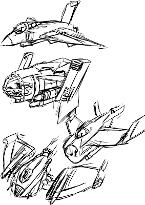
These where the ideas I drew up, only one of them ended up being a VTOL and it also turned out to be my favorite, I love the others even though the top one looks to much like a military fighter jet.
I then went to maya to try and model 2 of them, as you can see this one which is modeled on the 3rd sketch down didnt come out well and I wasnt enjoying how it looked once I started turning it into 3D, I couldn't get the front window or over all shape right.
The second one I modeled was the VTOL and I love how it came out. Its a very compact and actually tiny spaceship meant for a few people (1 or 2 maybe 3) I wanted it to be small so that it would be harder to pick up on radar and it would also be faster.


I then went onto rendering the ship and using the over lay feature on Photoshop I added colour to test to see which ones would suit it best.

The bottom two are personally my favorite, I like the blue one because it looks fairly clean and new but I like the green one for the opposite reason, its paint is worn off in parts and has scratches.

My friend then suggested that I try brighter colours like red and yellow so I did and they actually came out quite well I love how the white and red pattern came out and the yellow one withe the blue lights looks great too aside from the fact that it looks like a submarine.

Since I liked different features from different ships I decided to merge a few to see how they would come out.


I personally think that merging them was a great idea as the results were great I especially like the second red one because the stripes look good and I like the green one because the dirt, scratches and stripes work well together.


I took my favorite one and added details like wires, and interior and a planet so that the background wasn't so dark.


Tuesday, 15 March 2016

Life drawing

I really enjoyed this session of life drawing, I think it was because of the change of pace aka the were wearing clothes so we got the chance to draw something different.
This is one of my best ones I got the proportions quite good which made me very happy since I was using biro and Im always worried about making mistakes with it.

3-5 minute drawings

Charcoal poses

I really love how this one came out.

I adore this one even though the legs were too short (I used the magic of camera angles to make his legs look slightly longer, so it looks quite ok now), The bits I like the most are the hands and feet, I just love how they came out.

We then had to draw him in a dressing gown as it doesn't fit the body well so it was harder to get the proportions right, but I think I did a pretty good job.

I like the face on this one and I also think the hand came out quite well too.

SpeedPaint of Child on beach


In lesson we were given a really zoomed out picture of a Child in a whale suit on a beach and we were told to roughly draw the light and shade of the image. Once we had finished the rough we were given a full sized image of the picture and then had to add detail and to my surprise there were a lot of details that I really couldn't see in the zoomed out version, like the drool or the fly away hairs and birds.


I think the end result came out amazingly and I think it looks quite alike the original, some differences where the distances between the fish and the boy and the proportions of the boy.
To be honest when I loaded up the non-detail version I was very surprised at the difference, I honestly didn't realised how much it changed.

Spaceships with straight lines and curves.

In lesson we had to create ships based off straight and curved lines and they had to be diggers.

The first one was a test to get the hang of drawing spaceships because I cant draw vehicles that well and I think it came out well. Also I decided to base it off of a fly as you may probably be able to tell.

The second one is of a hover craft that digs with a lazer that comes from the front, it is quite sleek and streamlined so it could quickly move around and go into smaller gaps that bulkier ships couldn't.

The last one is based off of a Starnosed mole, its "nose" comes out the front and grabs dirt and minerals and pulls it inside itself and stores the valuable stuff, uses the fuel for fuel and dumps the waste.

The designs are pretty simple but as I said I'm not used to this type of designing but considering that fact, I think it came out well and I actually quite enjoyed it.


Sunday, 13 March 2016

Marionette Progress

I have finally gotten screenshots of our game from my teammates so I can now write up about what we have done.

This is the titlescreen of our game, of course its a WIP but this is the base of how we intend it to be layed out.


This is the first version of our game as you can see there are quite a lot of things that need improving, this was before we had really decided on an art style and before we had made some assets, the white box is "Marie" and the black/gray box is the "chest".

One of the problems I brought up was how small the characters where compared to the rest of the screen, the person in charge of coding said he made them this small so that it would look like they would be able to fit though the door, which was one of the things that led to us decided to change the background design another reason was because our teacher said it should look more like a Victorian sewer.


This is a much more recent version of the game as you can see the Rat has been redrawn in the new art style, and the background has been dramatically improved also we now actually have Marie with her walking animation and the mini-map has been implemented and coded.

Another thing is the dialogue box, currently we only have Reggies faces done (he even shows different emotion depending on what he says, which is the complete opposite of Marie who is pretty deadpan(mostly cause she cant move her face)) and the only problem with his faces is that its squished, and we dont know why.

Another thing you probably will of noticed is the door which was quickly done by the 4th member of our team we will redraw it as not only is it off but its not in the right style.

This is Marie's walking and pick up animation, her movements are very clunky because she is a doll and mosly to mask my lack of ability of animating, but I think that it actually looks quite well.


Monday, 7 March 2016

Spaceships in Perspective

In this lesson we were given an birds eye view of a spaceship and using guidelines had to move it into a 3 point perspective. I found this quite interesting considering I'm not to good at vechicals and I think I did quite good.

This was how far I got before the lesson ended, I spent quite a while trying to figure out the guidelines, and so I only got to draw a rough outline of the ship in the time I had.
I think the ship looks good even though its just a sketch and I may (want to) come back to it and work on it so that I can give it colour to see it that makes it looks better.

Composition

In our lesson we were given this image and told to mess about with the composition using the rule of thirds.

This is how mine came out, I started with flipping the image and I moved the house off to the side so the stairs were the center point, I also extended them so that they go across the image, the two opposing sections are the house and "keep out" sign.

I like how this image came out even though it is quite rough but thats mostly because im still not used to using photoshop yet, but it goes help give a sense of dryness and movement of the sand especially on the hill going down from the house. 

Tree with character

Our project for this week was to create a tree with character (not one with a face though) which was actually much harder than I thought.

I found some pictures and tried drawing some, the first one is boring as hell (mostly cause it was a practice cause I cant draw trees), I then tired a luminous tree on a dark background so the tree looks magical but then I got the idea of drawing a bonsai tree that is stuck indoors.
The image below has a fixed pot, though thr quality is lower because jpeg.

The idea behind this tree is its a tree stuck inside on a rainy day which is kinda sad cause plants need water and trees normally get it from rain, and its almost like the tree is looking longingly out the window, the side of the tree close to the window is bright and colorful and the side away is dull and blue. I love how the image came out especially cause i'm normally not that great at drawing stuff like this, yes its a bit messy and not very realistic but I still think I got the emotion across quite well.