
Monday, 7 December 2015
Mech
3D Art Production

My favorite part has to be trees, (because they look the best) my teacher helped me a lot with the making of the leaves and branches because I found it hard to grasp he also helped me neaten up the overhanging rock because the polys were all over the place.


The skulls and the candles (2 of the 5 props in the arena, the other 3 being, coins and signboard and the trees)

The weird peanut thingy is the size comparison of a human
Some parts look a little funky but over all I think it turned out quite nice especially considering how stressed I got over it, all thats needed now is to move it into unity and fix the lighting.

you may notice some textures missing and that is because Unity doesn't like keeping the two textures I mapped, together. (I wasn't told this until afterwards) and after trying multiple times and getting stressed like hell I decided to just show what I could do and as my peers have said, it isn't that bad and one even thinks it looks great without the textures that are missing.
 |
| One of my attempts at fixing it (allfailed) |
Speed Painting

I found the colouring side of easy too because I normally mess about with colours when drawing so I found it easy to pick the right colours.
The image is scruffy in places but I think considering I'm not used to Photoshop I think I did well.
Friday, 4 December 2015
Gameplay and Interactivity work.

I have found this projects extremely difficult from the get go, I found it hard to think of a level design and story but after fiddling around with cubes on unity and trying to create a building I came up with this strange looking building, I would say it looks like an ancient structure, maybe aztec maybe even a building from a fantasy world, but I did end up liking the design. After figuring out the "theme" of the level it made it a whole lot easier to create a key and pick a background song.
I find coding quite hard so that side of the project was a bit of a torture session for me especially because no matter how hard I tried I couldn't get the doors to work, my peers couldn't figure out how to fix it and even my teacher couldn't, so we just used my teachers doors that he used in an example.
All coding in my project was all done with the assistance of my peers as I'm kinda hopeless with it, but I'm grateful that they helped me despite being busy themselves.

I first started to concentrate on the lighting, but moving the overall lighting to look as if the sun was low and therefor the level had a drastic difference in lighting overall, I then added small lights to make it easier to see the path, they have no physical appearance because I wanted the lights to look like they were made with magic.
I then went onto the sound but searching on the assets store for a mystical (and free) soundtrack, and the one I found was the Warped Fantasy Music pack by Andrew Isaias and I used the track Exploring magic 2 as I thought it fit well with the level design and its timing fit pretty well with the walking speed.


The Key itself is a strange blocky shape that is shaped in that way as to confuse travelers, they wont know which way to put it in as you'd have to line it up with the key hole. The idea of they key is based off the boss room keys in LoZ Skyward Sword and I always found it fun to twist the key about to figure out how it goes in.
My level is very simple, its just walk to a door, be told to pick a key up, then find it and voila the door opens, very basic but considering its my first go and I found this project stressful, Im proud with how much I achieved.
Monday, 23 November 2015
Personal work 3

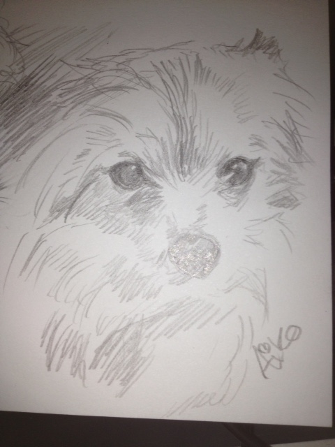

These first few drawings are of my dogs that I did during a black out, I based them off pictures I found on my phone and I think considering I'm normally bad at drawing animals that these came out well.
Warning Gore below.
I have always been fairly good at drawing gore (probably because I play lots of horror games) so I decided to test myself in a spare 4 hours I had to waste and lets just say I surprised myself with how gross I made it, Gross enough that my friend nearly puked when I showed him and I think that is an accomplishment so I decided to post it on my blog to probably scare a few people, and also cause im proud with the out come.
 |
| Add caption |
Anthropomorthic Frog
 |
| References |
 |
This frog's pose is based off this dead frog my mum found in our garden, that looks like it is laughing, so I decided to make my frog cheeky and because it is doing lots of laughing I decided too give him teeth. I really liked the yellow frog with black splodges so I went with that colour scheme especially because I could use the spots to make it look like the frog has freckles to give it a cheeky look. I really like my frog came out, I think he looks slippery and has human characteristics (clothes, teeth, and the fact he is laughing) without losing his froggyness. |
Scifi room

My finished scifi room, its not very good, but considering futuristic stuff and buildings arnt my forte I think it looks ok, its a bit messy because I am still getting to grips with using photoshop.
its a bit plain and dull but I do like the boxes of robots and the screens, I think they are the nicest part.
Tank
 |
| Trying different lighting (I found it quite hard mostly because I cant draw vehicles) |

 |
| Tried to do shadows behind the tank, I don't think they turned out. |
Life drawing lesson 8
 |
| 3 minute drawings this was my best one out of the lot. |
 |
| Perspective life drawing. |

 |
| Drawing everything but the model, I really like how this turned out. |
 |
| I really enjoy drawing with biro every so often because it comes out well. |
Saturday, 7 November 2015
Personal work 2
 |
| More personal work, as you can tell its much better mostly because I used Sai. I really like how the eyes came out. |
 |
| I drew this one in less than an hour. |
Thursday, 5 November 2015
Tentacle Monster
 |
| Out of all of them this one came out the best and I am crazy proud with the way it turned out especially with how it looks wet and slimy. Even though the tentacles are supposed to be the main point I love how there are only a few thin ones that grossly peak out of the mouth whilst supporting the eyes. I really really love this image :). |
I decided to try out both of my favorite designs on Photoshop because I couldn't decide between the two, I decided to work straight onto a scanned version of the sketches because I loved them so much and didn't want to ruin them by redrawing them |
| I like how the face came out on this one and how the strange muscle tentacles look but I was honesty lost on what to do with the main tentacles so I coloured them as best I could and slapped a paper texture over them to give them some...texture. |
 |
| Top image is an Octopus person which is a relatively unoriginal boring design but I decided to draw one to see if I could make it interesting. Bottom image is of a 4 headed woman, who has tentacle like necks and tentacles coming out of her back. |
 |
| This is one of my favorite design because of the way the face came out as well as the way the muscly tentacles things came out. |
 |
| Left image is a 4 tentacled cyclops monster with tusks and spiked suckers running up and down its tentacles. Right image is some sort of human octopus combination, it has the overall shape of a human face but it has a beak, octopus eyes and tentacles coming out of everywhere. |
 |
| This is another one of my favorites because its just so gross and crazy and I adore how it came out, It kind of looks like a Tattoo design. |
 |
| This one kind of looks plant-ish to me I think its because the insides of the tentacles kinda looks like a Venus fly traps "mouth". |
Sunday, 1 November 2015
Personal work 1
 |
| Since I find using Photoshop hard (cause I normally use Paint tool Sai) I decided to mess about with Photoshop to see if I could improve, and even though I cant figure out how to blend my work nicely on Photoshop I think it came out really well, I even like the colouring style I had to use, even if it makes her skin look blotchy. |
Halloween Special - Zombie
 |
For Halloween we were given this texture map of a girl and a Maya file that had the texture on a model that was animated to move along like a zombie, our task was to make her a zombie.
After changing her face to a different woman, I lowered the saturation in her face to make her paler and then made her eyes misty and veiny also I added small dull blue veins and spots all over her skin to make her skin look thin and diseased.
I then did what I do best, I made her look...dead I made her face look hollow and sore by using dull purples, blues, blacks and reds. I love how her face turned out (I spend most time on it so its a good thing I do)
I then made her sleeves tatty and roughly darkened part of her clothes to make them look worn. I also made her nail dirty and bloody and finally I covered her in blood splatters and dirt to make it look like she'd be 'round killing.

I love how she turned out because I managed to make her look tatty and dead but not rotted and gross, so you can still see the human in her even if she is eating people.

Close up of her glorious face.
|
Wednesday, 28 October 2015
Life drawing lesson 6
 |
| This was a 30 minute drawing and I found it very hard because I prefer quick drawings, I drew her head a bit on the large side but other than that I like how it turned out. |

 |
| These 4 images where when we had to draw 2 poses with 2 different types of media at the same time and then swap hands. I find it very strange how my left handed one turned out better considering i'm right handed. |
 |
| 3 minute Sketches (my best ones to date) |
 |
| Pencil drawing where we had to concentrate on tones and not outlines, I found it quite hard but I like how it turned out (30 minutes) |
Life drawing lesson 5
 |
| We had to completely cover out page with Charcoal and then rub away at it with a rubber, this was to make us focus on the lighting over the shading and outlines. |
 |
| I love the way the back looks |

 |
| We were told to use a different media so I went with pen and I think it turned out really well and I am immensely proud of it, especially because I couldn't erase and It still came out neat looking. |

 |
| Another one where we had to draw the model as he moved, this one was harder than last time because this model walked faster. |
 |
| 3 minute sketches |
Subscribe to:
Comments (Atom)